

holiday product photography that still feels like your brand
Holiday content that sparkles!
Holiday content has a tricky job.
It needs to feel umistakably seasonal without making the brand disappear underneath it.
For this Rocksbox shoot, the goal was to create imagery that felt festive, polished, and giftable while still staying true to the visual world we had already established for the brand.
And that didn’t require completely reinventing everything just because it was December.


Start with the brand, not the holiday
It’s easy to begin a holiday shoot by thinking about all the obvious seasonal ingredients: red, green, ornaments, evergreen branches, twinkle lights, ribbon.
But the better starting point is the brand itself.
What colors already belong in it's world?
How does the lighting usually feel?
Is the brand playful? Minimal? Luxurious? Bright? Nostalgic?
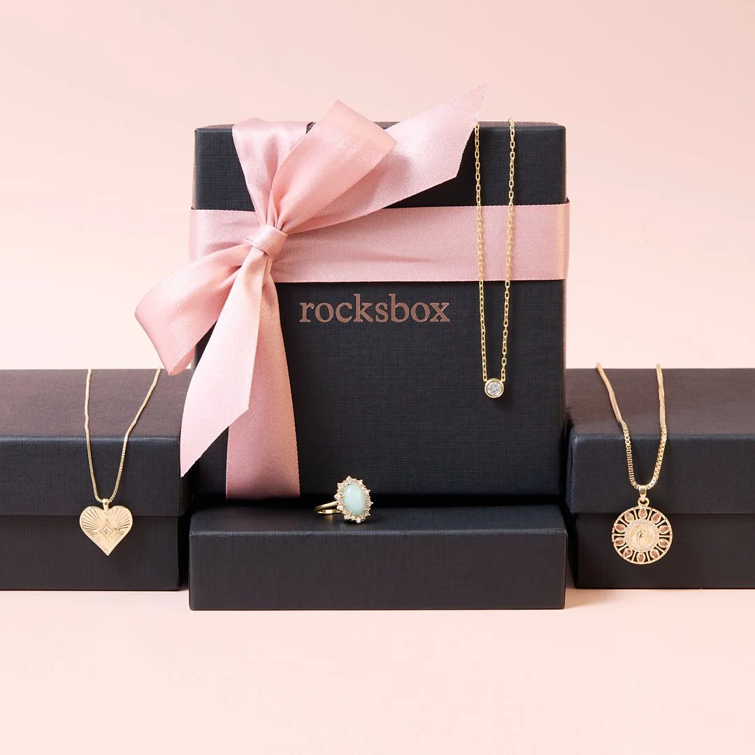
For Rocksbox, we stayed with the cream and light pink backgrounds we were already using and brought the holiday feeling in through smaller details.
Light pink ribbon became a gifting cue.
Their packaging was wrapped and tied with a bow.
Letter necklaces were arranged to spell JOY.
And some pieces didn’t need holiday props at all. The jewelry itself was enough.
You probably need less “holiday” than you think
Seasonal cues are powerful because people recognize them immediately.
WHich also means you don’t necessarily need very many.
A ribbon.
A wrapped box.
A candy cane.
A familiar word.
Sometimes one detail is enough to place an image firmly in the season.
We did use candy canes in one of the Rocksbox photographs (about as unmistakably Christmas as you can get) but because the lighting, color palette, styling, and overall visual treatment stayed consistent with the rest of the brand imagery, it still felt like Rocksbox.
That’s the balance.
The holiday element can communicate the season without becoming the entire image.
The classics aren’t the problem
I’m not anti-ribbon.
I’m definitely not anti-candy cane.
And twinkle lights will always have my support.
Traditional holiday imagery works for a reason. It carries an immediate sense of nostalgia, celebration, and gifting.
The question isn’t whether you’re allowed to use it.
It’s whether it actually belongs in the visual world you’re creating.
Instead of asking:
What looks like Christmas?
I’d rather ask:
What does Christmas look like for this brand?
That shift keeps seasonal photography from becoming interchangeable.
Subtle styling can make the content work harder
There’s another benefit to not making every image aggressively hholiday-specific: some of the content can live beyond December.
An image centered around gifting, ribbon, sparkle, or beautifully wrapped packaging may work just as well for Valentine’s Day, Mother’s Day, and anniversary promotion, or another gift-giving moment.
That doesn’t mean every photograph should be evergreen.
Some images should absolutely scream Christmas.
But creating a mix of highly seasonal imagery and more flexible assets gives the brand more ways to use the work.
Make the season fit the brand
Holiday photography doesn’t need to look identical from one brand to the next.
A few familiar cues can do a lot of heavy lifting.
For Rocksbox, cream and pink backgrounds, delicate ribbon, wrapped packaging, playful typography created with the jewelry itself, and the occational unmistakably Christmas prop were enough.
The season was there.
But Rocksbox was still recognizable underneath it.
And ultimately, that’s the goal:
Make it festive.
Make it intentinal.
And make sure it still feels like you.




BONUS: It’s one thing for me to show a gallery of images, but it’s really something special to see the work in wild. Here’s just a taste of how Rocksbox incorporates the images into their branding:
